Información necesaria
Nombre a incorporar en el logotipo
Zingage
Eslogan a incorporar en el logotipo
Descripción de la organización y el público al que apunta
We are rebranding from Ava to Zingage. We drive growth, retention, and performance in your workforce through communications and rewards infrastructure. Right now, our customers are health care / home care agencies, but we plan to expand horizontally to all other frontline industries over the coming years. When clients interact with Zingage, they should feel peace of mind, like they hired an amazing GM who immediately understands their business goals, keeps them up to date on the important data about their employees, and produces the growth, retention, and performance results they crave by executing the work either they or we come up with.
Industria
Tecnología
Estilo visual
Colores a explorar


Otros requisitos relativos al color
We want to stay reminiscent of our current brand, which is why I selected green and orange, but are open to changing the shade, or pulling in a different color if you think that would look best. Defer to your expertise.
Atributos de estilo
Diseño de inspiración
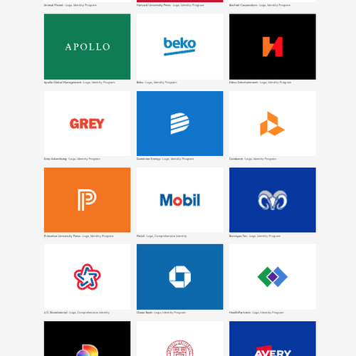
I like chermayeff and geismar's work historically. Things like the chase, mobil, nbc logos and brand. Because of what we do with rewards and tokens it's incredibly important we have a memorable symbol. "a symbol must be memorable and have some barb to it that will make it stick in your mind. at the same time it must be attractive, pleasant, and appropriate. the challenge is to combine all of those things into something simple." In terms of overall brand aesthetic beyond the logo, Im a huge fan of bloomberg - this is the model for what we want to bring the frontline, a singular source of data, content, and communication you can trust. (edited)
Referencias
Adjuntos
Otras notas
We want our new logo and visual identity to feel tied into our current brand, so not completely separate, but definitely refreshed and more sleek and sophisticated.
We are rebranding from Ava to Zingage. Along with the name change, we are evolving our mission, product offering, and positioning, and we want our visual identity to reflect this transformation. This rebrand is an evolution, not a complete departure, incorporating more sophistication and fresh energy into our current visual identity to align with our new direction. Zingage embodies energy, sophistication, and engagement, reflecting an evolution from our previous identity, Ava. We aim to create a modern, lively brand that is refined yet approachable. Our tone balances professionalism with vibrancy, appealing to both fast-moving and traditional industries. The brand should evoke empowerment, motivation, and trust while maintaining reliability. Through dynamic, fluid visual elements, Zingage conveys movement, connection, and a fresh sense of engagement, all while evolving naturally from the Ava brand.
Because of what we do with rewards and tokens it's incredibly important we have a memorable symbol. "A symbol must be memorable and have some barb to it that will make it stick in your mind. at the same time it must be attractive, pleasant, and appropriate. the challenge is to combine all of those things into something simple."
Archivos finales del concurso
1 x Logotipo
Archivos finales
Si usa tipos de letra que requieren licencia, confirme que el cliente esté de acuerdo con su uso. Por motivos de licencias, es mejor proporcionarle a su cliente información sobre cómo adquirir el tipo de letra en lugar de proporcionarle los propios archivos.
El texto en logotipos debe convertirse a letras sin relleno.
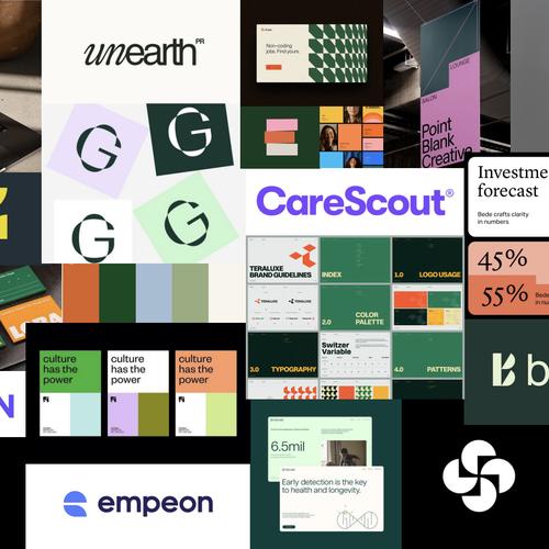

- We like the "un" in "unearth," but do not like the italics "n" inside of connect RN
- The botanicals logo is a great idea - recognizable letter that also communicates the idea of the brand name
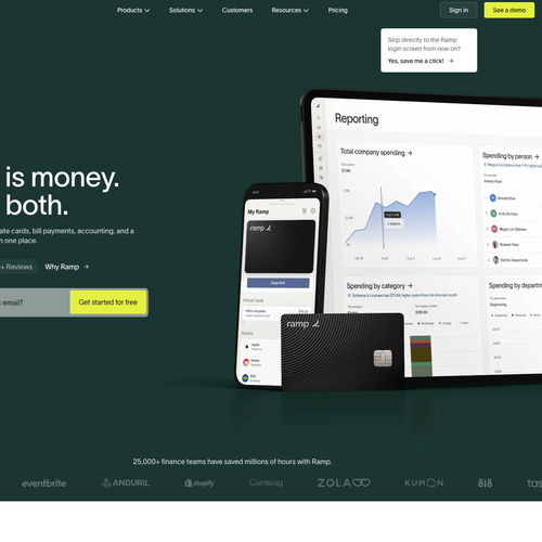
- Like secondary punctuation color on tango
- Dark green of botanicals is nice
- Orange in teraluce probably our favorite orange - it's very bright so would need to be strategic about how we use it