Natural Table Card for Plant-based Restaurant

0
Creados en 99designs de Vista
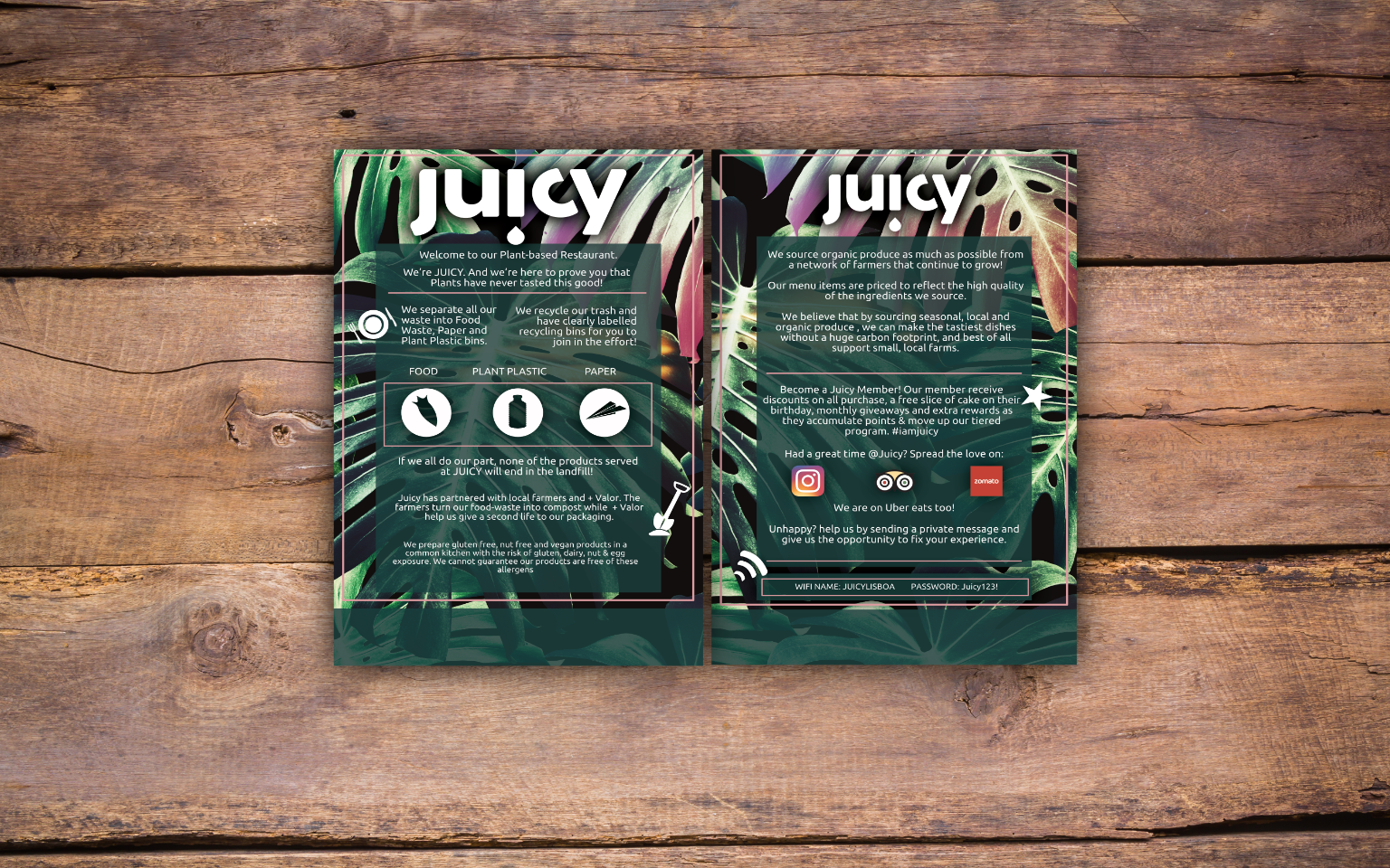
Front (left) Back (right)
I predominantly used green for the table card as it the obvious colour for natural/ organic brands.
I used small highlights of salmon pink to created interest.
I created icons for different aspects of the deisgn and coloured them white to stand out.
I used these to create more visual intrigue and to make it more fun.
I used a variety of effects to emphasise elements e.g. shadows on the title.
I scaled the background image to provide the best level of interest and detail and positioned it to make best use of the rich colours of the leaves.