We live in a world where we’re increasingly dependent on the internet for everything we do. Think about it: where did you find your last job? How did you apply for that job? How do you do your banking? Where do you do your shopping? How do you stay in touch with your friends and loved ones?
The internet may be an ever-present resource for most people, but for those living with a disability, connectivity is not always a given. There are programs and devices that make it possible for people with disabilities to access your entire website, like screen readers, but these are only part of the solution.
The other part of the equation is designing websites and apps in a way that makes them accessible for people with disabilities, either through the use of assistive devices or simply through thoughtful design.
Why accessibility in web design is important
—
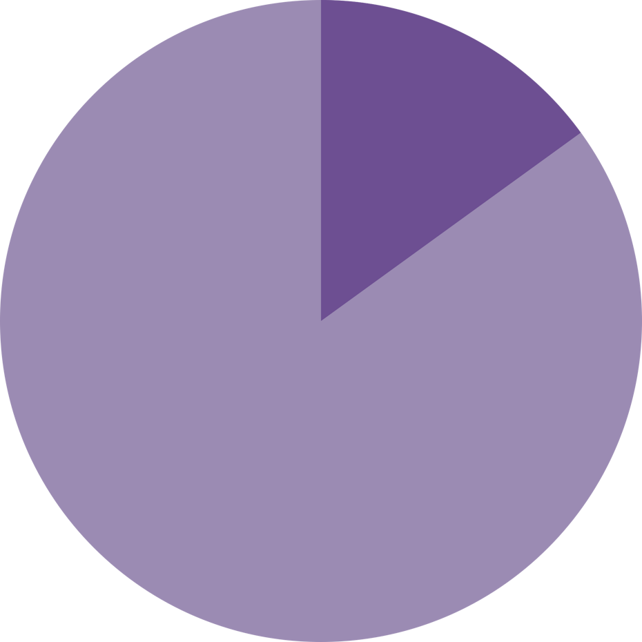
According to data from 2012, close to one in five Americans lives with a disability of some type. Worldwide, approximately one billion people, or 15 percent of the world’s population, lives with a disability.
Not all disabilities keep people from reading screens and using the internet. For example, these figures include individuals who rely on walkers and wheelchairs. But other conditions, like visual impairment, difficulty grasping objects, autism and deafness, just to name a few, can severely limit an individual’s ability to use a computer or smartphone without accommodations.
Accessibility in web design: in some places, it’s a suggestion—in others, it’s the law
—
If you’re in the United States, you’re probably familiar with the web compliance standards that are part of the Americans with Disabilities Act (ADA). Lots of other countries around the world have similar compliance guidelines in place, like the Australia Disability Discrimination Act, Brazil’s Law on Accessibility and the European Union’s eEurope Action Plan.
Many of the guidelines included in these laws and initiatives come from the global Web Content Accessibility Guidelines (WCAG), a set of guidelines created and maintained by the World Wide Web Consortium (W3C) through its Web Accessibility Initiative (WAI). Enough acronyms for ya?

W3C was founded in 1994 by Tim Berners-Lee, yes, that Tim Berners-Lee, with the purpose of creating guidelines and protocols that promote the long-term, sustained growth of the World Wide Web. Today, it’s comprised of more than 400 organizations, many of which participate in the WAI. The most recent version of guidelines it’s published is WCAG 2.1, which came out in 2018.
WCAG 2.1 includes all the latest guidelines and best practices web designers should follow to ensure that their sites are accessible for all users. It’s a long, dense document made up of lots of technical jargon. Instead of plunking yourself down for the next two months to read the whole thing, design your website with the following accessibility principles in mind. Then, have a developer audit your code to bring your accessibility-minded design to full compliance.
Give your images alt tags
—
Alt tags are brief descriptions of the images you use that get buried in the site’s html. Most users never see these descriptions, but site visitors using screen readers rely on them to know what’s in the images on your website. A good alt tag is a short, creative description that accurately describes the image it’s attached to.

Take a look at the image on the left. Here’s an example of a good alt tag for this image: realistic illustration of fish and bread loaves in a basket.
And here’s an alt tag that’s not quite as good: bread and fish
See the difference?
Alt tags aren’t just for visually impaired users’ benefit; they’re for your benefit, too. Well-crafted alt tags improve your site’s SEO, which means more relevant site traffic and ultimately, more conversions.
Keep your navigation predictable
—
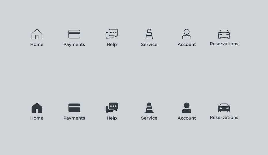
The navigation system your website uses should be consistent across its pages. This includes the icons you use and the way visitors get to different pages within the site. For example, if your homepage has a top header bar with drop-down menus, each of your other pages should have this arrangement, too.
Similarly, the icons you use across your website need to be consistent. Don’t have a telephone receiver for the “contact us” icon on your homepage, then a smartphone icon on your About page. It’s confusing and can make it very difficult for accessibility programs to figure out how to use your site. You should also stay away from any kind of automatic navigation and auto-playing music and videos.
Why? Because not only are they annoying, it’s difficult for a user with a screen reader to determine how to pause them. And when a slideshow or carousel scrolls through content at a rapid rate, users can become confused and frustrated.
Avoid content that can cause physical reactions
—

Remember the episode of Pokemon that caused close to 700 kids to be rushed to the hospital because it triggered seizures in them? It’s the reason why your game consoles now come with photosensitive seizure warnings. Some people are prone to suffering seizures when exposed to rapidly flashing lights and moving patterns. Avoid these kinds of animation on your website to keep it safe for every user.
Make your text big, bold and organized
—

Make your website easy for people with limited vision to see by making your text large. Basically, make it the equivalent of a large print book. 16px is a generally a good size for body text, with headers being larger.
There’s more to making your text readable than making it large. Use a font that’s legible and easy for users with dyslexia to read. The United States Department of Health and Human Services recommends Times New Roman, Arial, Helvetica, Tahoma, Calibri and Verdana as accessible fonts. You can play it safe by choosing one of these, or look for another font that will work for all your website’s visitors. The fonts that are easiest to read are fonts that:
- Have no serifs
- Have fixed widths between letters
- Use bold letters

Your text should also be organized in a readable, logical way. Break text into smaller sections divided by headers and sub-headers. This doesn’t just make your text look neater, it makes it easier for screen readers to decipher for their users.
Finally, your text should have a high contrast against its background. Text that is too similar in color to its background is difficult for many computer users to read, particularly users living with color blindness. Use an online tool like Contrast Checker to see how your planned font and background colors work together.
Make it work with a keyboard alone (and without one)
—

Some users can’t grasp a mouse or keep their hand steady on a laptop’s touchpad. These users rely on their keyboards to navigate websites, so make yours usable for them by building it in a way that makes it fully functionable with just a keyboard.
There are also users who can’t use a keyboard and rely on other means of navigating websites, like speech recognition programs and head-mousing. Your website should also be compatible with these kinds of programs, because without them, people without use of their hands will be unable to use your site.
Get your code audited (or do it yourself)
—
Don’t release your website onto the world until you’ve had all your code audited by a competent developer who’s familiar with the latest web accessibility best practices. Alternatively, you can use an auditing tool like Google Chrome’s WAVE tool, which will find spots in your code where you’re missing key accessibility features. It never hurts to have a human developer review your code after you’ve run it through a tool like WAVE to ensure that nothing was overlooked or taken out of context.
Make it possible for everybody to use your website
—

Remember why you’re making these design choices: to remove any barriers that can keep people from using your website. Sure, you also want to be in compliance with the law and avoid creating a situation where you’re liable for a user’s discrimination damages, but always remember the reason for the guidelines you have to comply with: When your website is designed with all users’ needs in mind, nobody gets left out.


